Honeywell Pulse
Winner of the 2018 Honeywell Innovation Award
The Brief
When managing a site such as an airport, prison, hospital or commercial building, critical issues need to be addressed immediately. There can be serious operational and financial implications from missing an urgent alert, with this functionality becoming a key requirement for our enterprise software solution.
While this capability was built into our desktop software, there was a clear customer need to be able to receive notifications about critical issues wherever they were. A native app was identified as the best technical and business fit, to be created as an extension of our existing products.
My role: Initially UX designer then UX project lead, onboarding 12 months after product launch
Key Design Challenges
The app needed to seamlessly integrate with our existing products
Failure alerts had to be highly customisable and tailored for each individual site’s requirements
Push notifications needed to be carefully managed, as too much ‘noise’ would obscure the true critical events
The UI had to reflect the seriousness of these events, with speed, accuracy and readability being key performance metrics
Fast and contextualise collaboration between users was identified as essential functionality for the successful resolution of issues
The Solution
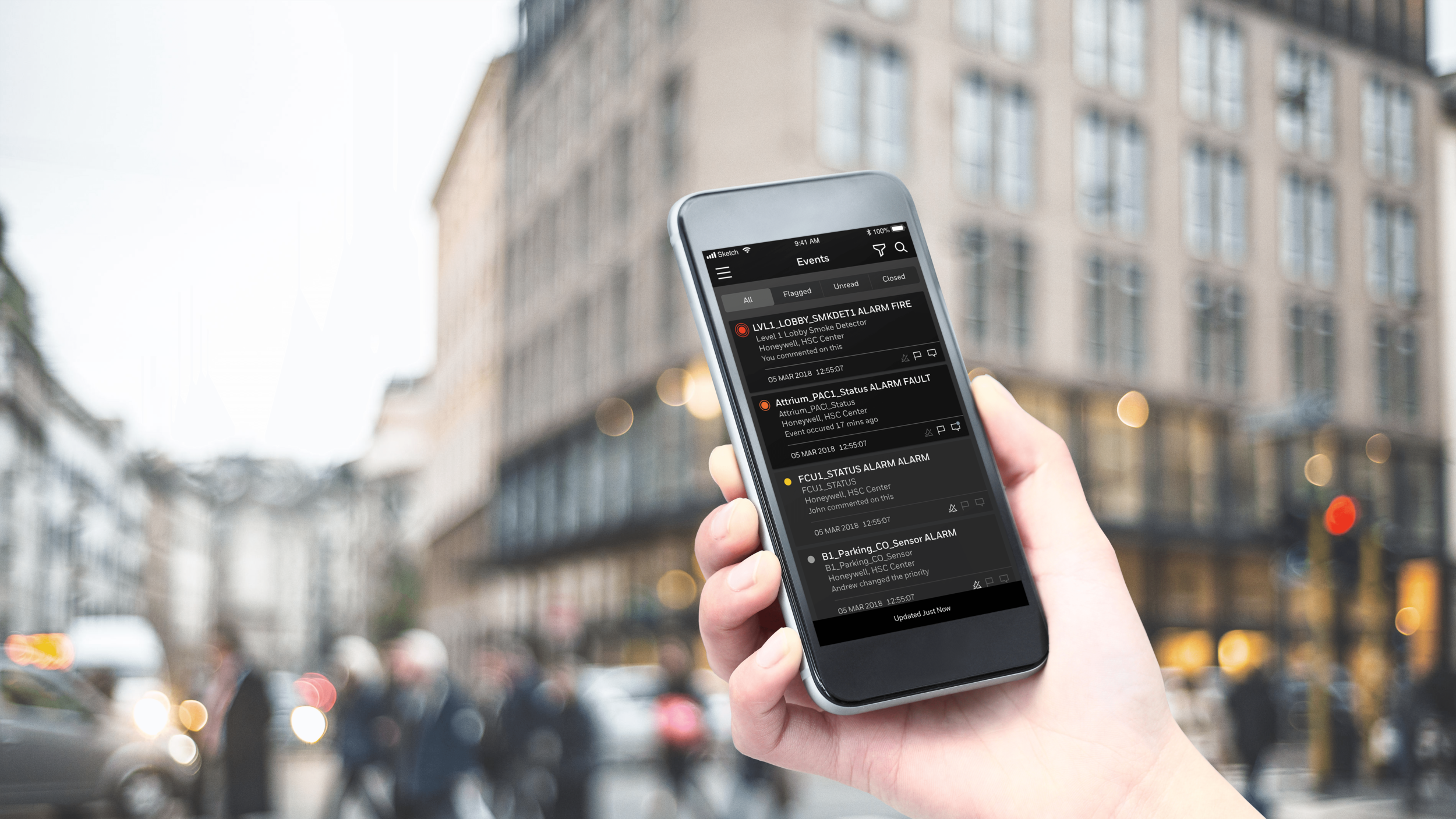
Honeywell Pulse is a native mobile application for iOS and Android that instantly alerts users when critical issues occur on-site.
I worked closely within my design team and with stakeholders and customers to define a core set of requirements that users would need to receive and resolve events. Once this was solidified, we went through a highly iterative and collaborative prototyping process, with regular usability testing and feedback sessions.
After the design was finalised I worked closely with development teams to build and successfully deliver the product to market, navigating technical challenges while constantly championing a customer-centric experience.
Maintaining a clear hierarchy of information was a crucial problem to solve when designing this app. We carefully summarised and ranked data for each event, utilising our research to know pieces of information was required for a user to make an accurate decision. Colour, font weight and size, spacing and subtle shadowing of UI elements reinforced the visual hierarchy, ensuring the design met the key readability and accuracy metrics.
Data density was also carefully managed and optimised for the smaller mobile screen. Customers needed to maximise the amount of events shown without having to scroll, while maintaining the needed levels of information for each item. This was achieved after numerous iterations and testing to find the ideal balance between the two.
Collaboration between users was another piece of essential functionality identified that we needed to design for. Drawing on current industry standards, we implemented a messaging feature that integrated within each event. This empowered users to more efficiently solve issues, as rather than waste time switching between communication platforms and having to needlessly repeat information about the issue, this was seamlessly streamlined into one coherent experience. Changes to the event were embedded in the chat itself, so that users did not have to switch between screens to stay up-to-date.
Technical Skills
Sketch
Invision
Abstract
Adobe Photoshop
Jira
Confluence
Design Skills
UX/UI design
Requirement creation and prioritisation
Wire-framing and prototyping
Usability testing and feedback sessions
Rapid prototype iteration based on feedback
Product delivery with development teams


