FrogID
Gold Winner at the 2019 Sydney Design Awards
The Brief
The Australian Museum needed to collect large quantities of data for one of their primary initiatives, but did not have the manpower required in-house. They needed to map frog species locations and population spread across Australia, as frogs are key environmental indicators used to predict future climate events. Many species are also currently facing extinction due to the current climate situation and increased habitat destruction.
Through empowering the Australian public to be able to record frog calls, they aimed to rapidly accelerate their data collection. Audio recordings of the frogs was the central focus, as listening to the call is the only way to accurately identify species.
As a highly public institution, it was imperative that the app met all current accessibility standards and guidelines.
My role: Initially UX designer, then UX design project lead, scrum master and product owner, onboarding 6 months after initial launch
Key Design Challenges
The app needed to be intuitive for a wide range of demographics, including school children and senior citizens
Limited resources and a short timeframe for delivery meant that accurate prioritisation and team efficiency was essential
The app had to be particularly technically robust, as most frogs are found in dark and remote locations, with limited reception and opportunities to charge devices
The UI had to reflect this conditions as well, and be optimised for dim environments
The record function was the primary action, and needed to be highly accessible and intuitive with a very low error count, to maximise data collection
The Solution
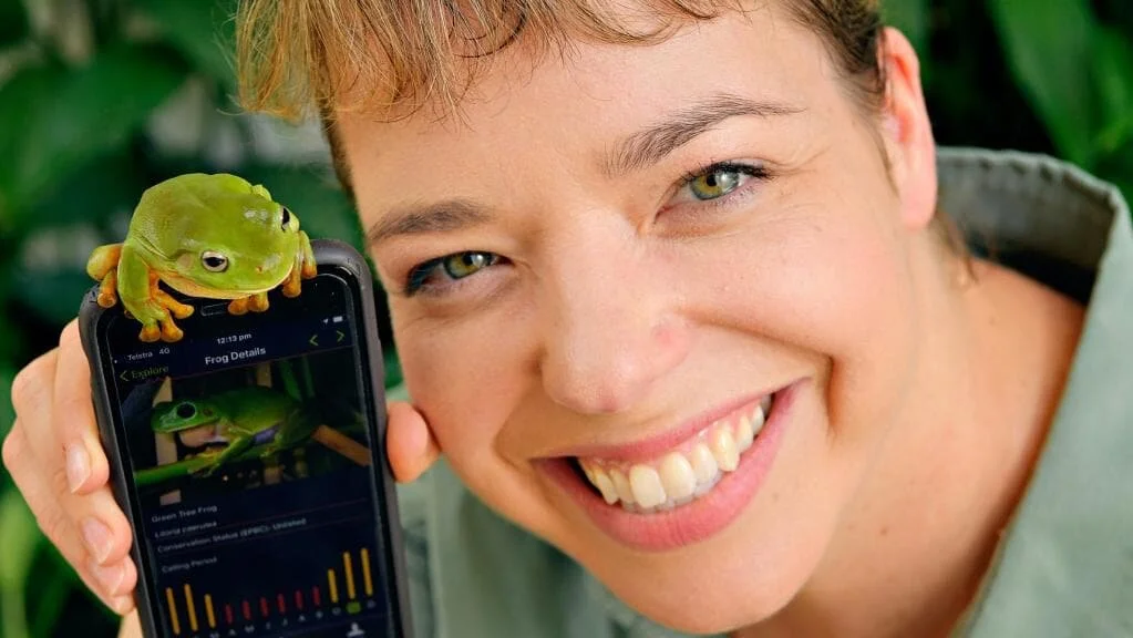
A native mobile application for iOS and Android that informs and delights about native frog species. The unique carousel of frog images invites users to start exploring, where they can learn further information about Australian frogs.
I worked closely with the Australian Museum throughout the duration of the project to define requirements and prioritise the team’s workload. As testing and the Museum’s needs to continued to evolve the product, this was an ongoing and iterative process to ensure the client’s expectations were successfully managed and aligned to product delivery.
The record function is easily accessible and technically robust, with focus on ensuring that data would not be lost at any stage and would maintain high audio quality, and that the location information was accurate across a wide range of scenarios and devices. This was a result of a great collaboration effort between myself and the developers to keep design and technical delivery aligned for the best experience for the user.
The dark colour scheme was similarly informed, to optimise the UI to be used in dim or completely dark conditions. The dark blues and oranges were selected for their intensity levels remained balanced and aesthetically pleasing across different lighting conditions.
User testing found that personalising the results increased interest and repeat use, so the app automatically filters species by your location and time of year, as different frogs call at different times. Filter and search options make it easy for users to expand beyond this and explore the entire database.
Since its public release the app has proved hugely popular, with thousands of downloads and nearly 200,000 verified frog calls submitted so far, and has been featured in numerous publications.
Technical Skills
Sketch
Adobe Illustrator
Adobe Photoshop
Jira
Confluence
Design Skills
Lead UX designer
Lead client liaison
Requirement creation and prioritisation
Wire-framing and prototyping
Usability testing and feedback sessions
Rapid prototype iteration based on feedback
Product delivery with development teams


